In this post, you’ll learn five ways to create pin-worthy graphics to help promote your blog, online shop, social media, and more.
If you’ve been making your way through my design school series, I’m guessing you may be a blogger or online content creator. If you’ve got something great to share, you need artwork and graphics that are compelling enough to bring readers from your social media channels back over to your site. Pinterest is the most visual of the social media sites, so it’s essential that the artwork you create is interesting and engaging, so that others will want to pin it.
I can’t stress the importance of having a strong opening piece of artwork, either right at the start of your blog post or below your intro paragraph. This is your first chance to make an impression, so take it! When I first started blogging, Pinterest wasn’t even invented yet, so I still have old posts where you don’t see an image until halfway down the page!
For this exercise, I decided to go back into my very first free printable post, and create an engaging, pin-worthy opening graphic.
Not just one graphic, but five. I thought this could be a fun little experiment. Below you will see five different approaches to creating an eye-catching piece of artwork. I’m going to send all five of them out into the Pinterestphere to see which one gets pinned the most amount of times.
Pin-Worthy Graphics Basics:
– Vertical images are more visible on the Pinterest platform, so choose a portrait orientation and make sure that it’s at least 600 px wide
– Include the text from your headline and at least one photo from the post
– Don’t give all your information away in that one piece of art, or nobody will have the need to come over to your website (I’m looking at you, infographics)
– Always include a watermark or a visual indicator that it came from you
Method 1: Inside the Box
A classic and simple image at the top and a color block with text on the bottom, or vice versa.
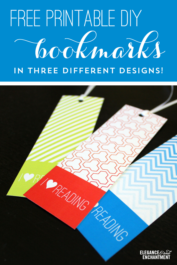
Fonts used for the blog artwork in Method 1: Ostrich Sans //Carolyna Pro Black // Trade Gothic Condensed
Method 2: Text on Top
Simply place your text directly on top of your image, in a space where it won’t interfere with the image. Try to avoid having the text lay directly on top of a busy part of your photo, to avoid readability issues.
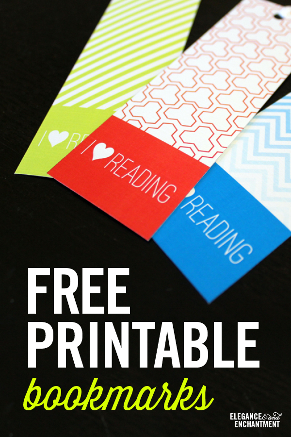
Fonts used for the blog artwork in Method 2: Trade Gothic Condensed Bold // Thirsty Script Light
Method 3: The Shape Overlay
Choose a shape or graphic to hold your entire headline comfortably, and place the text inside. Feel free to add a playful subhead and additional graphics like an arrow, as I’ve done below.
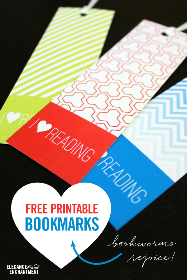
Fonts used for the blog artwork in Method 3: Trade Gothic Condensed Bold // Quickpen
Method 4: Transparency Overlay
Maybe you want to place your text directly on top of the image, but you don’t have space clear enough to fit all of your text. This would be a good time to create a see-through shape or box that lays over the image. Make sure it’s opaque enough to see through to the image below but still clear enough to read the type on top (I try to stick between 75% and 90% opacity).
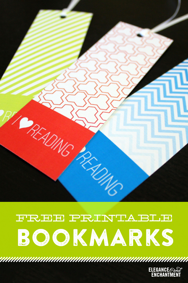
Fonts used for the blog artwork in Method 4: Archive Antique Extended // Brandon Printed
Method 5: The Collage
Include a few shots from your post to give your readers an overview of everything that will be covered in your post. Don’t go overboard and include so much information that they have no reason to visit your wonderful site!
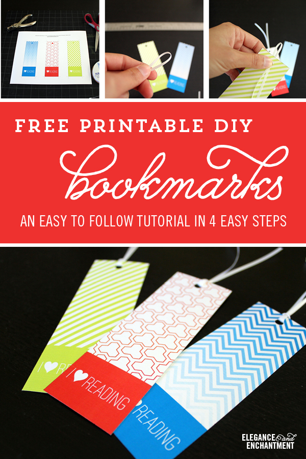
Fonts used for the blog artwork in Method 5: Trend // Melany Lane // Trade Gothic Condensed Light
Which of these five methods do you think is working most successfully? I can’t wait to report back with my results!
Creating your own pin-worthy graphics
I’m assigning some homework for this lesson. Will you join me in conducting your own Pinterest experiment?
Choose one of your existing posts, and create some new header artwork using a few methods above. You can even start with two if you don’t have the time to design all five. Pin each of your options and see which one of them takes off!
PS, If you want to download these lovely bookmarks, you can find them here.

This post contains affiliate links.
