Email is still the best marketing platform, but are you catering to a 2023 audience? Here are tips for designing an email newsletter your readers will look forward to opening.
 As a long-time internet creator, I feel I’m constantly defending the original platforms.
Blogging isn’t dead! Bring back the old Instagram! Email marketing still rules!
While I have recently embraced Reels and even TikTok, I’m not convinced of their effectiveness. The popularity of these mediums is unmatched, but all that means is that more creators are using them, making it more challenging for you to be seen.
Are email newsletters worth it?
As you may have gathered from the title of this post, I’m still on team email. I’ve shared this ad nauseam, but the benefits of the medium bear repeating:
No algorithm. Do you know what’s the worst? Spending an hour creating a Reel that’s only served to a fraction of your audience. With email, there are no gatekeepers, and your messages get delivered to your recipients every time.
Less competition. Email marketing is thought to be complicated, and many creators avoid it. It’s also executed behind the scenes, where engagement stats like likes and shares are only available to you. Some people need public-facing social media accolades to feel like their work is valued. Email marketing will become your best-kept secret if you are okay with privately celebrating your wins.
Introvert-friendly. You’re not alone if you have ever felt overwhelmed by social media. Email marketing is much more aligned with how introverts communicate, with opportunities for deeper connections and time to think and respond between interactions.
Designing an email newsletter in 2023
The medium of email newsletters is still effective, but content consumption habits have changed. And so we adapt!
After using Convertkit for my emails for years (since 2015), I recently switched to Flodesk. I still love Convertkit and will continue to recommend them. Nobody matches their ingenuity and scope of features to help online creators grow and generate revenue.
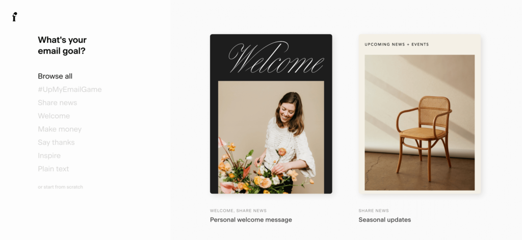
However, one of the things that Flodesk does better is design, and as a designer, that’s my number one priority. Not only did the switch to Flodesk force me to simplify my workflow, but it also motivated me to send more emails because the platform is really pretty.
Building email newsletters for engagement
I knew that the rise of video and short-form content meant fewer people would be interested in reading long blocks of copy. Flodesk knows this too.
Their platform is equipped with pre-designed blocks that allow you to share snippets of content, making it easy for you to create and for your readers to consume.
Alternatively, you can choose from one of their already-designed email templates and modify it to fit your aesthetic.
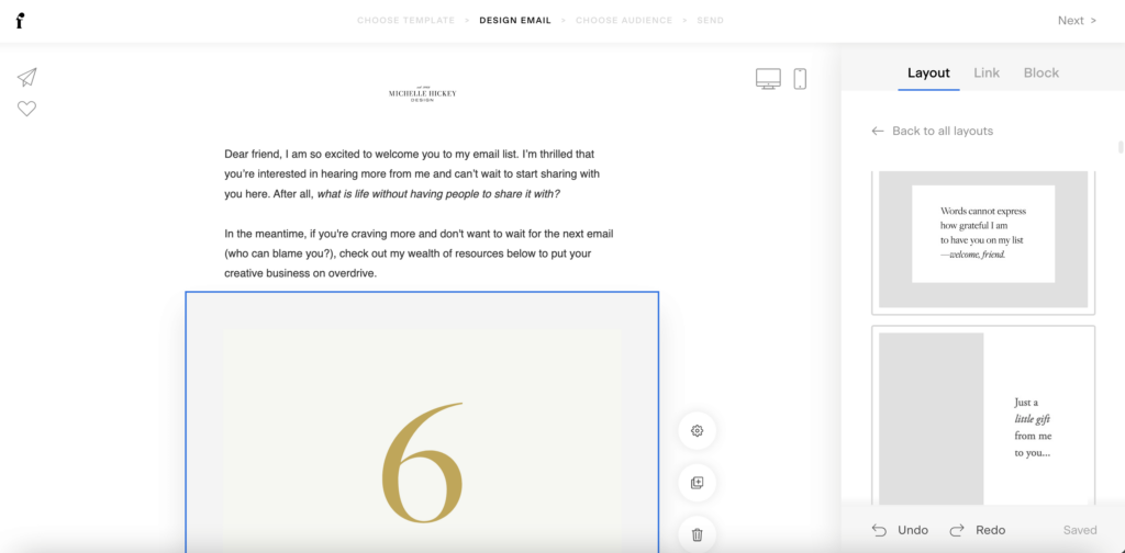 What to include in your email newsletter
If drag and drop is your style, you will love Flodesk’s design options and usability. Here’s a list of content ideas you can use to fill in your newsletter:
- A quote that’ll inspire your audience.
- A short, actionable tip.
- A personal story and use it as an opportunity to teach a lesson.
- Links to new blog posts, podcasts, or video content.
- Highlight a resource or tool (use affiliate links whenever it’s a fit).
- An exclusive photo or piece of art that you haven’t shared anywhere else. Flodesk has a built-in way of sharing gifs and stock images.
- Highlight products from your shop or services you offer to clients.
- Behind the scenes or a coming soon snippet.
- Gather valuable insights through a survey or feedback form.
- Exclusive downloads. Even though they may have already received them, I re-share my email opt-ins in every email to encourage and remind readers to use the resources.
- Positive feedback and testimonials from happy customers and clients.
- Links to content from other creators in your niche.
- Re-share your social media content to boost your engagement. I love that Flodesk has a widget that showcases your most recent Instagram content.
Choose the content blocks that best align with your brand and use them as a framework for your email newsletter. Not only will this create consistency for your readers, but it’s easier for you to fill in the blanks than to create from scratch every time.
Customizing your email newsletter design
Another reason why I have loved using Flodesk is that they make it so easy to customize your newsletters to fit your brand’s aesthetic.
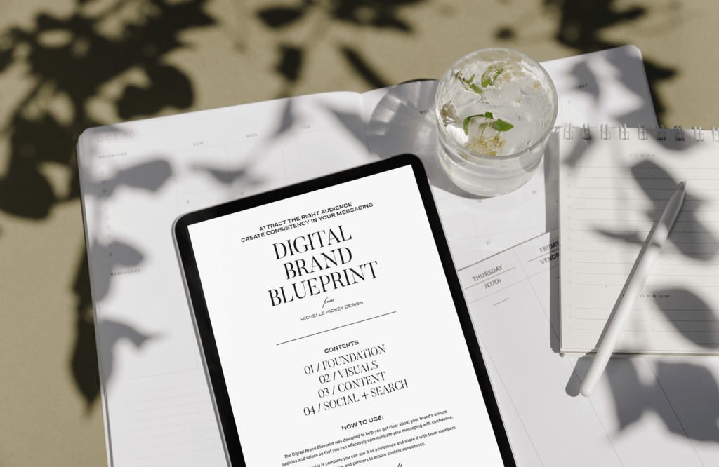
If you’re not confident about your brand’s look, click here to download this free Brand Blueprint. It’ll help you refine your style so that you’ll be more excited to show up and share in your email newsletters.
 While there is far less competition in email inboxes than on social media feeds, it’s still important to get specific and hone your language to best appeal to your audience.
Design your email newsletter to suit your brand
My newsletter is catered to small creative businesses and individuals who create and share online content. But the folks who best connect with my brand are fellow old souls who appreciate vintage typography and musical theater gifs and love staying home on a Friday night to watch an old movie.
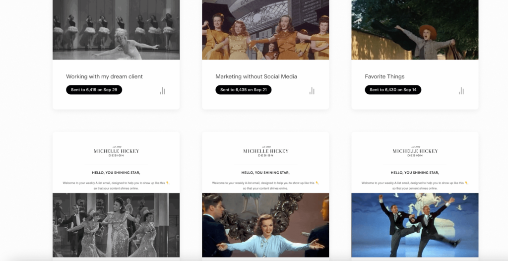 Even though most of my newsletter content is to help my audience create wins, I weave in elements like classic cinema gifs and links to retro finds because that’s my brand’s style. The tips and tricks I share can be found elsewhere. But not many mix hashtag research strategy with a tap dancing Fred Astaire.
What bit of flair can you add to your brand’s newsletter to make it more unique and special to your audience?
Sending your email newsletters with consistency
Once you have finished designing an email newsletter and have a framework, it’s easy to maintain. While my weekly blog posts can take hours to write and format, I can usually get my email newsletter designed in 30 minutes.
I love the cadence of a weekly email, but if that doesn’t fit your business or schedule, consider monthly or even quarterly.
Sending sporadic emails is better than sending no emails, but I encourage you to establish a consistent schedule. It gives your audience the sense that you’re reliable, it gives them something to look forward to, and it also helps you to stay on track.
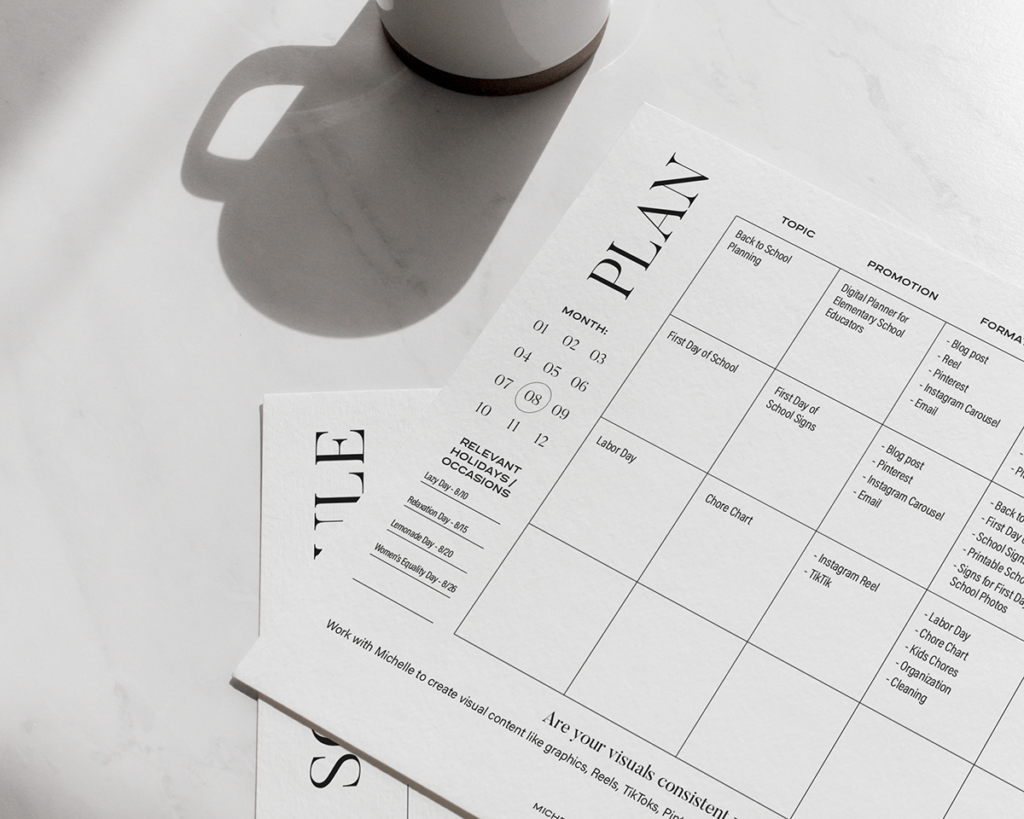
If the idea of sending regularly scheduled emails feels daunting, click here to download my free Content Planner and Scheduler. Once you get your thoughts written out and you’re able to add them to a platform like Flodesk easily, you’ll feel organized and ahead of the game.
 Are you feeling invigorated to start designing your email newsletter?
Here are your action steps:
- Get signed up with an email platform. My affiliate link to Flodesk will give you 50% off your first year. They have easy instructions if you need to import a list from a different service like Converkit or Mailchimp.
- Explore the templates, or design one from scratch, using the list of content blocks above as a resource.
- Design your new first email, adding your brand’s voice and flair.
- Schedule and send.
- Copy and repeat.
Bonus step: Share a link to your email opt-in in the comments below or share a description of your email newsletter. I’d love to hear about what you’re creating!
This post contains affiliate links.

