This post covers designing with stock illustrations and includes tips on how to differentiate your work so that you can stand out online.
Stock illustrations, fonts, and backgrounds have paved the way for creatives who want to create top-notch designs. We may have a vision but not have the time or talent to create everything from scratch.
But there’s a hurdle: how can we use those resources uniquely to set your designs apart from others? Personalizing your artwork doesn’t require heavy thinking, just a little experimentation.
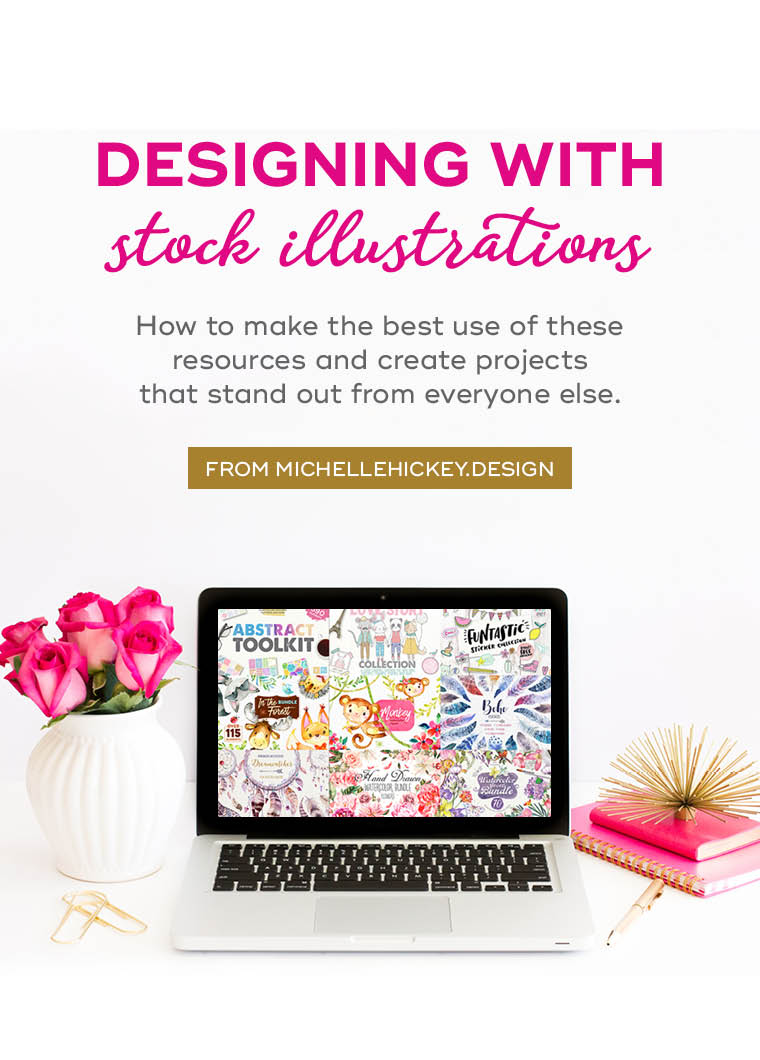
Make your designs better with stock illustrations and fonts
I realized that my strongest skills are in layout and design, not drawing and lettering. Once I came to terms with the fact that I wasn’t finding enjoyment in spending hours trying to create my own illustrations or learning calligraphy, my designs became better. It allowed me to put more energy into areas I was most passionate about.
I began to treat my design process like making a meal, where I source the best ingredients and then use my skills to create a stellar end product. Our site’s sponsor, DesignCuts, has been my go-to source for fonts + graphics for two years, and I’d be lost without them!
The problem with stock illustrations
The downside to using stock illustrations and fonts is that all those resources are available to the public. Therefore, you risk creating something that looks just like everyone else’s.
I’ll be the first to admit that my earlier designs look completely generic and void of uniqueness. After years of experimentation, I’ve developed some tricks to make those stock illustrations my own.
Defining your brand style
Before I share the steps you can take to make stock resources your own, it’s important that you have clarity about your brand style. This process involves soul-searching, determining what colors, moods, and subjects mean the most to you, and finding ways to incorporate those elements into everything you create. Even if you can identify one small element that will be your constant in every piece you design, it will make a difference.
Click here to download a free Brand Blueprint to help you with this process.
Five tips to make stock illustrations your own
Think of stock illustrations as a starting point. Your goal is to make them unrecognizable from their original form. Here are some steps you can take to alter and transform:
Scale your stock illustrations.
Often stock illustrations come to you in the form of hundreds of small drawings on one page. Consider plucking just a single element from that sheet and making it the focal point of your design.
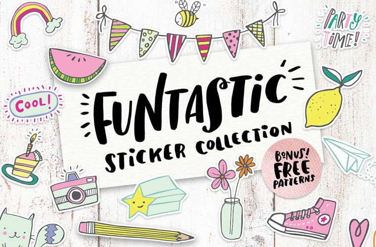
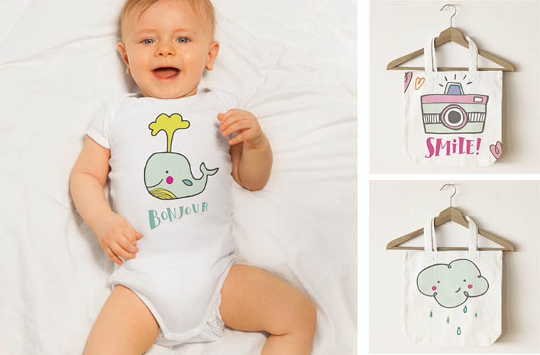
In this example, single illustrations were taken from this massive sticker pack and used to create multiple products. It doesn’t get easier than that!
Recolor your stock illustrations.
I recolor just about every single stock illustration I use. Color is the factor that’s the most noticeable to the viewer, and this small change can make a big difference.

In this example, I used these adorably illustrated balloons and brightened them with my own color palette for this Baby Shower Invitation. Bonus: I also used the cloud background and removed the texture for a cleaner look.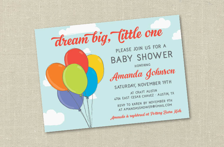
Rotate + Flip your stock illustrations.
Change up the orientation of your elements. Reflect the artwork so it faces a different direction, or rotate it so it appears on an angle or even upside down.
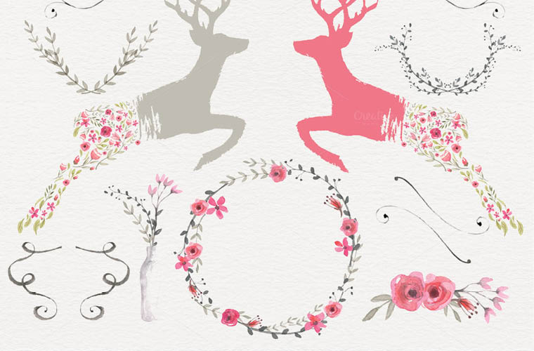
In this example, I took those pretty watercolor roses and did some rotating, reflecting, and flipping to create the art print below.
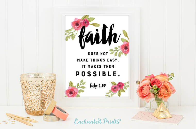
Multiply your stock illustrations.
Copy and paste is your friend. Create multiple instances of a single element to create a new look. You can even copy and layer objects, like backgrounds and patterns.
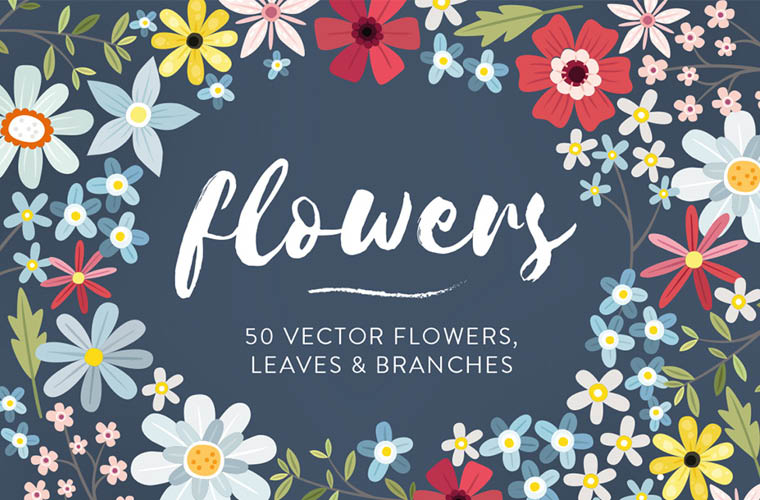
In this example, I did a whole lot of multiplying! This floral vector pack gave me a ton of options. I chose my favorite 4-5 flowers and went copy-crazy.
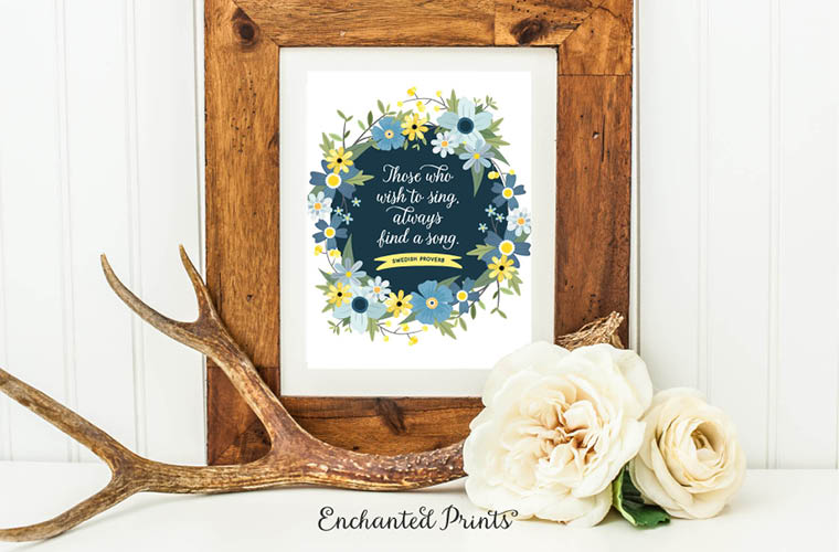
Mix your stock illustrations
To me, the easiest way to differentiate your work is to pull elements from different sources and combine them to create something brand new. Even if your illustrations come from different artists, you can adapt them to fit the same style by altering the colors, strokes, and placement.
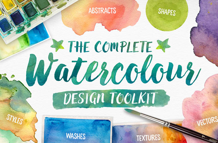
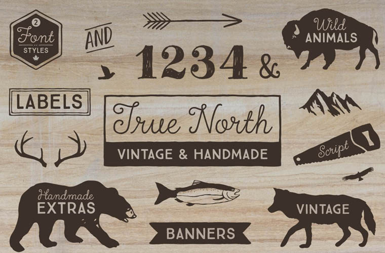
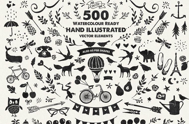
The art print seen below was a culmination of three different resources to create something new!
Click here to shop for a similar Watercolor Pack
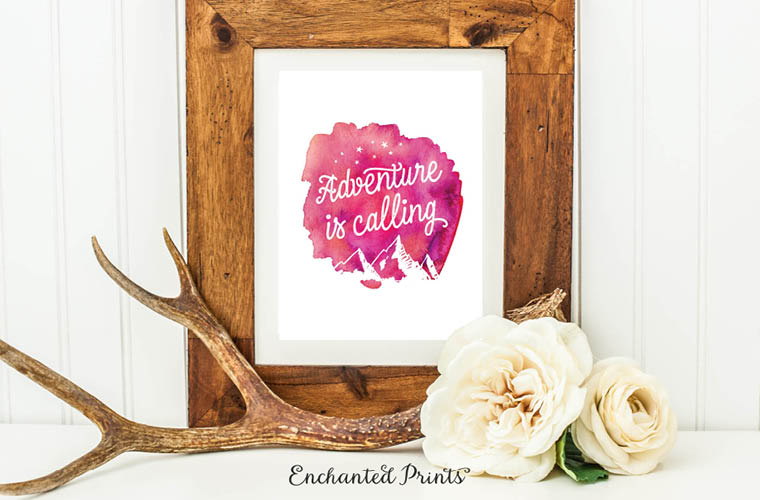
While I don’t suggest using stock art in its original form, don’t drive yourself crazy with alterations. Think simply. It only takes a few small tweaks to change the look.
The best file formats for altering stock illustrations
I find vector files (.eps and .ai) easier to adapt, recolor, and scale than rasterized files (such as a .png). But as always, I encourage you to work in the way that is most comfortable for you. There’s not a black-and-white “right” way to do things.
Most DesignCuts resources include multiple file types so that you will be covered either way.
The more you are comfortable with yourself and your personal style, the easier it becomes to make stock illustrations your own. Don’t forget to grab that Brand Blueprint guide to help you hone your aesthetic.
This post contains affiliate links.


Such a fantastic article. Thank you for sharing!
Thanks so much, Jen! Glad you enjoyed it. 🙂