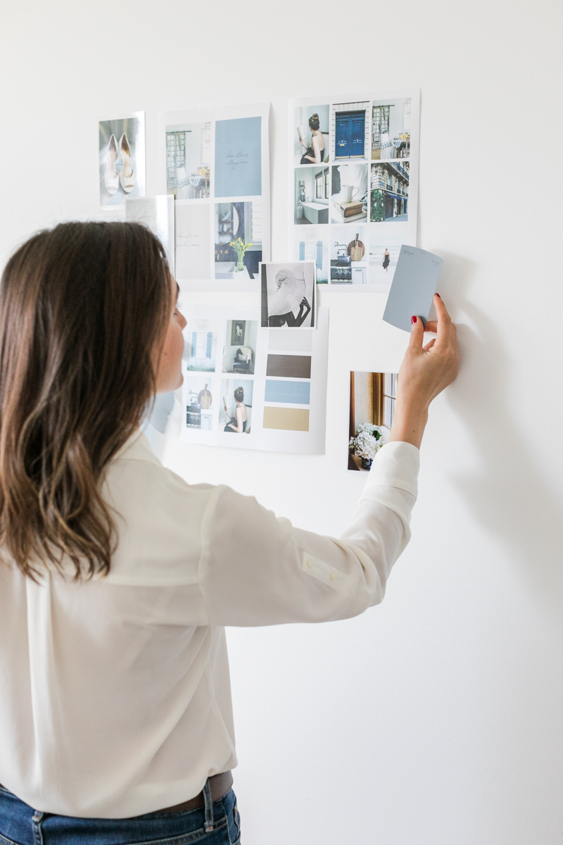
A beautiful vision board needs more than just great images. A well-executed layout can make all the difference. In this post, I share my best tips for designing a digital vision board.

It took a few weeks to settle in, but I’m finally feeling ready to take on this new year. There were a few things I did that helped propel me in the right direction, but none was more impactful than creating my digital vision board. If you missed the reveal, you can find it here.
Have you created a vision board yet? If you haven’t, and you’re planning on it, what’s holding you back?
Creating a digital vision board, without the stress of permanence
The traditional vision board method is to cut words and imagery from magazines and use adhesive to create a collage. But to me, the process felt messy. I disliked that the source material was limited. And frankly, as a graphic designer, I’m used to having a little more control of the layout—not to mention, the ability to make changes with a couple of clicks.
A well designed vision
Not everyone cares a great deal about aesthetics, but if you do, the layout becomes just as important as your chosen words and imagery. Without an effective design, it’s likely that your board will feel like something is missing. And if you are unable to fully connect to your final digital vision board, it’s less likely to be effective in helping you live your best year.
Tips for designing a digital vision board
I take my digital vision board process as seriously as if it were designing it for a client. Much time and consideration were taken to select the images, and even more to determine their placement. If that sort of thing matters to you too, below you’ll find my best tips for ensuring that your digital vision board not only speaks to you in its content but its presentation.
Choose more images than you think you’ll need
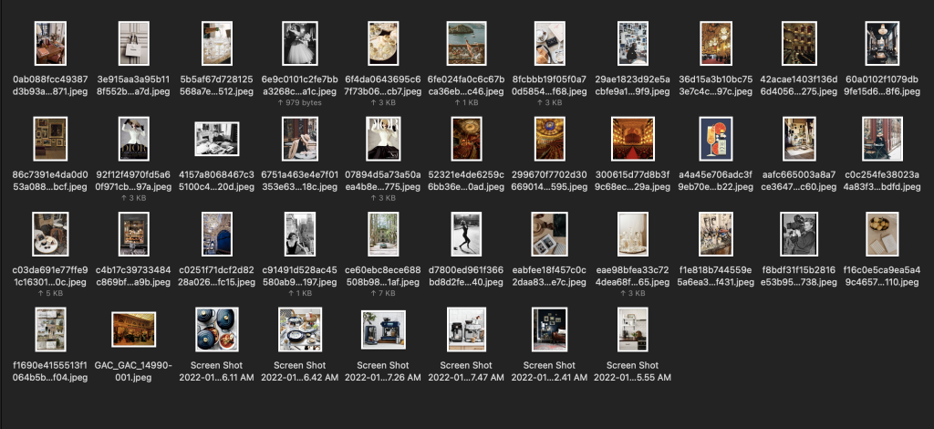
Be very liberal in your image searching. Get loose. I encourage you to save as many images as you’d like, even if you feel as though you might be going overboard.
Let this part of the exercise be akin to a brainstorming process. There are no bad ideas.
Although you may begin with a list of things you hope to do or attain this year, you may be surprised to see your horizons expand. If you see an image that appeals to you, and you can’t explain it, then don’t. Just save it and stick it in a folder. You can figure that part out later.
Use your feelings
As you are conducting your image search, I encourage you to push beyond literal representations of your wishlist. You may want to manifest a new car, or better clients, or toned arms—but how do you expect to feel when those dreams become reality? How will you evolve as an individual in the process?
For example, you may find three different images of your dream car. One may be in motion, speeding through the streets of a city. Another might be filled with a happy family. Or perhaps it’s sitting in a garage-style museum setting, like Cameron’s dad’s car in Ferris Bueller’s Day Off.
If you are hoping for a new car, don’t just choose the first one you see. Take the time to find an image that best represents the way in which you hope to enjoy it.
Lay out your vision board like a puzzle
When you begin placing your images on your vision board, do not expect it to look good right away.
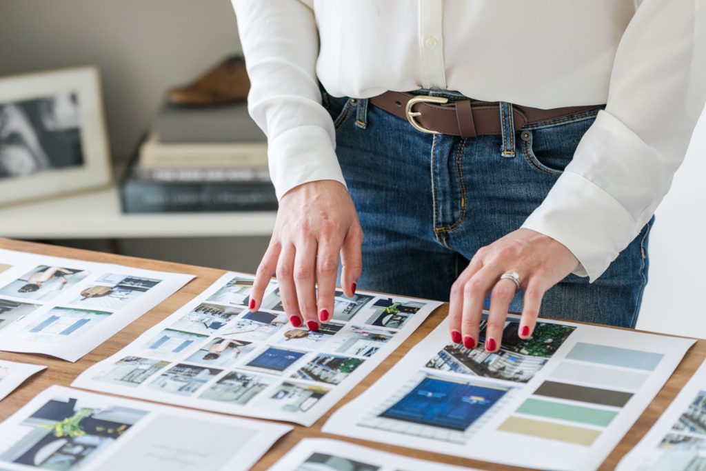
Like a puzzle, your layout will take some experimentation to see if the pieces fit. Unlike a puzzle, there is no reference photo, which means you get to lean on your unique creative instincts to create a configuration that looks and feels like everything you hope the next year to be.
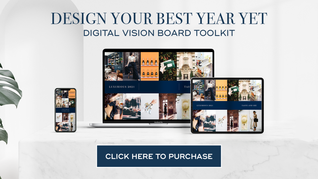
Inside The Digital Vision Board Toolkit, you’ll find a pre-made layout sized for each of your devices, so you can skip the step of figuring it all out. Click here to purchase
Here are some design tips to help solve for the best layout:
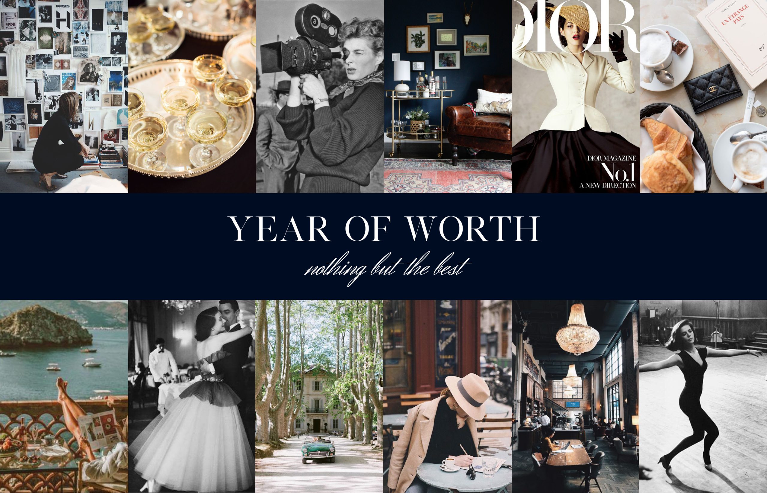
Do not place two “like” images next to one another. For example, on my board, there are several images of people. I made sure to spread them out so that there weren’t any spots where two large figures were next to one another or on top of one another.
Balance light and dark. When you step back from your board and squint your eyes, are you immediately drawn to one section? If so, there might be too much color, darkness or lightness in a concentrated area. Separate those images and spread them out.
Stick to a color palette. In doing this exercise, you may realize that you inadvertently chose images in a like-color scheme. This happened to me, except that I ended up with one rogue, ruby-red image that would not fit, no matter where I placed it. I searched for an alternate photo in a different color, but I was coming up blank. In the end, I swapped it for something entirely different.
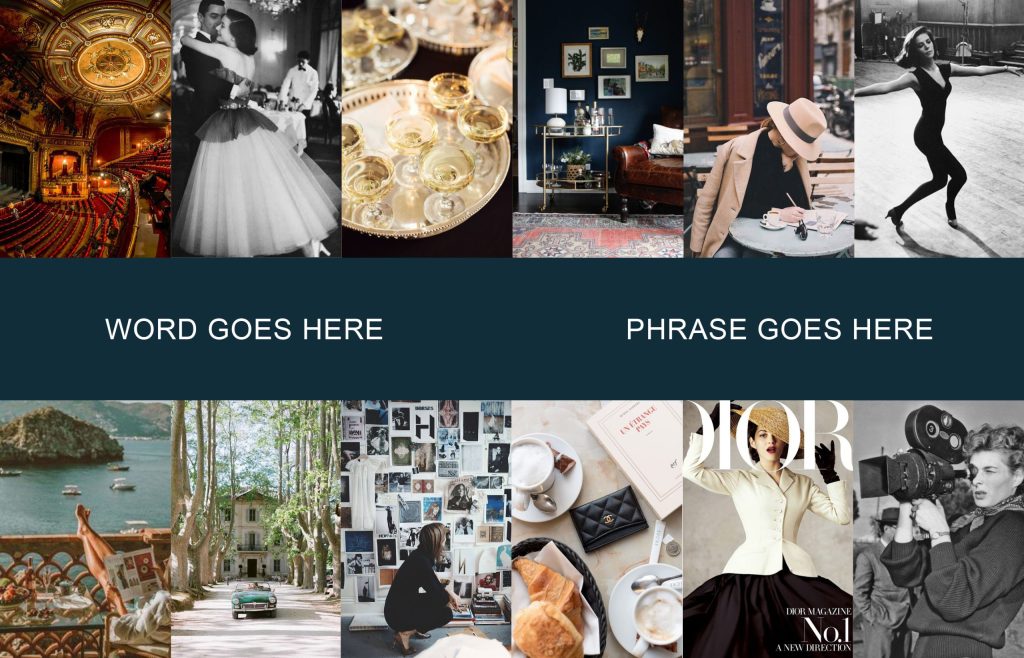
That red image would have annoyed me all year if I left it, so I chose aesthetics over function. If the latter is more important to you, leave the image, even if it doesn’t look like it belongs. You are the client here—make yourself happy!
Create visual movement. Without noticing, when we look at art, our eyes go on an adventure. Pay attention to the direction in which your figures are facing. If they are all turned right, you’ll likely follow their gazes right off the edge of your screen.
The same is true of the composition of each individual image. Do large concentrations of color cause you to get stuck, or bored? If so, shuffle things around.
The movement that feels most natural to me is a gentle up and down, like a really smooth rollercoaster. As your gaze travels across your digital vision board, does it feel like a comfortable journey? If the answer is yes, you’ve succeeded.
Add corresponding typography
By this point, your layout should feel cohesive, which will make your typography selection an easier process. As you are adding the words and phrases that will guide your year, choose a font that matches the look at feel of your board.
If your design is bold and intense, you may want to consider a heavy typeface. A softer, gentler aesthetic might have you leaning toward a font that looks more feminine.
Play around and experiment with placement and scale.
Ignore everything I just shared
Yes, I mean it. A vision board is personal and unique to each individual, therefore your feelings override design rules and principles.
Does it make you happy? Do you feel good? If so, your digital vision board is complete!
CREATING YOUR 2022 DIGITAL VISION BOARD
Ready to get started? This easy-to-use toolkit gives you everything you need to create a beautiful board for all of your devices, including an instructional video, a PDF of my process, templates, a bonus audio resource, and exclusive accountability emails that you’ll receive from me 4x/year.
This is a one-time purchase, and your access to the toolkit does not expire, so you can work on your timeline, and use it again, year after year.
Photos 1 and 3 by Stocklane
