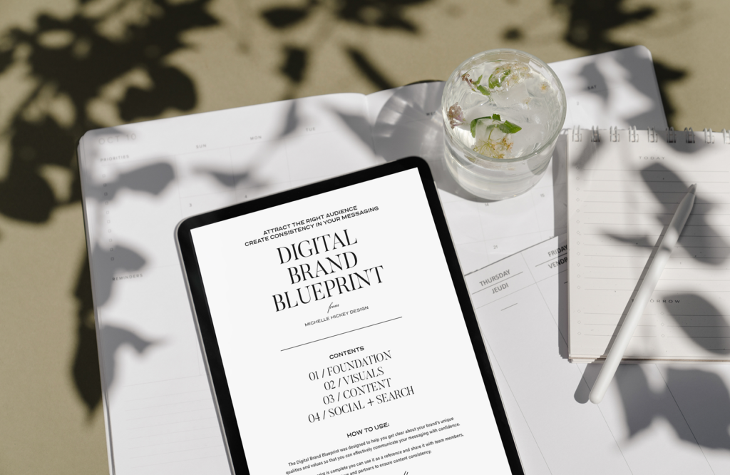
In this post, you’ll find five simple ways to update your branding aesthetic when you don’t have time for a full redesign. I also share a free downloadable Brand Blueprint to help you streamline your content creation.
This post contains affiliate links.

Thank you to everyone who sent me kind messages about my site relaunch. I’m still beaming over the new look and feel an unmatched sense of rejuvenation.
Cringe-worthy branding
Do you continually push your own brand to the back burner? I think I talked about a redesign for two years before I took action.
Yet, if we aren’t able to communicate our value, or we’re embarrassed by our visuals, we won’t show up.
Earlier this year, a friend wanted to recommend my design services to a colleague, and I cringed. I feared she’d look at my website and run in the other direction. Or she’d scroll through my Instagram and exit in a state of confusion.
How would you feel if I wanted to send a potential client or customer your way today? Are you positioned to receive them? Or would you be inclined to hide?
After going through a complete rebrand and design overhaul: from logo to content to website, I’m kicking myself. I fell into that all-or-nothing trap when I could have strengthened my brand sooner by making minor tweaks.
Five simple ways to update your branding
If you’ve been wanting to refresh your digital brand presence and don’t have the time or capacity to do a total makeover, you’re not alone. But please don’t hide. Let’s bring your brand up to date using these five simple tweaks.
1 | Update your social media bios with a clear sentence about what you do.
Copy/paste into all the places you have an online presence, even if you don’t actively post. Use this formula and fill in the blanks:
I help (ideal client/customer) __________ with (your service) so that (the outcome you’ll deliver) __________. Feel free to add some flair and highlight a quality or style that makes your business different.
2 | Curate your imagery.
Create a folder of go-to images on your computer that match the feeling you want to evoke with your content.
If you are looking for free stock imagery, check out Pexels or Unsplash and choose images shot by the same photographer or from the same collection. If you want to up-level, consider subscribing to a stock image subscription service like Stocklane or HauteStock. Save 15% on stock photos and videos with code MICHELLE15.
3 | Edit your fonts and colors.
If your font library looks anything like mine, it feels like walking into an all-you-can-eat buffet. Playing with fonts and color combinations is fun, but using too many styles confuses our audiences.
Limit yourself to two fonts and two colors and see what kind of creative magic you can make. Prepare for instant elevation.
4 | Choose a signature photo filter.
A single photo filter, not ten. Select one that best suits your brand’s tone and apply it to all your images or videos. You’ve likely seen the built-in filters on your phone or in the Instagram app.
Alternatively, you can purchase a set of presets from a photographer or consider a photo editing app like A Color Story, Tezza, or VSCO. If you’re looking for video filters, check out an app called Splice, that I use for my editing.
5 | Own your schtick.
What you do and who you are are not always the same, and that’s a good thing. Your brand needs a differentiator. What makes you unique? When a friend texts and says, “I thought of you when I saw this,” what did they send you? Think of creative ways to inject that signature “thing” into your content.
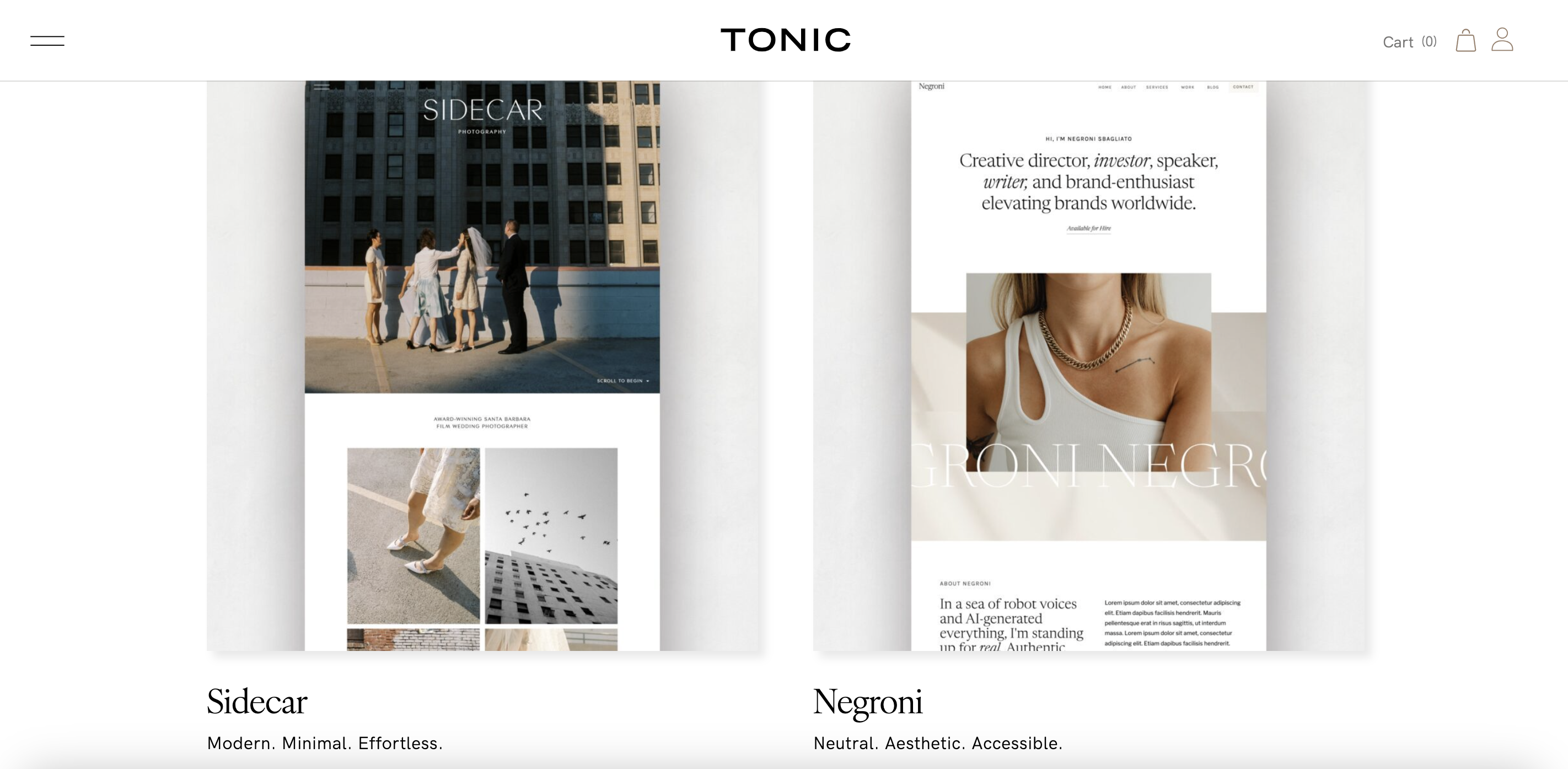
Tonic Site Shop, the business from which I purchased my site theme, is an excellent example to follow. They sell Showit site templates, and fancy drinks are their schtick. I love how they integrate the cocktail theme into their content and products. It provides their audience with a memorable concept and distinguishes them from competitors.
Bonus: Fill in your Brand Blueprint and hone in on your signature style.
I designed this guide with digital brands in mind. You have enough to keep up with and have likely been toting your brand details around in your head. Fill in the blanks so that you have everything in one place.
The next time you sit down to create a piece of content, you’ll have all the information you need to showcase your brand in the best light. Click here to download it for free.

Update your branding with simplicity
Even if you do one of the items on this list today, you are moving in the right direction. For extra accountability, share in the comments or send me a message on Instagram, and let me know about your latest update!
This post contains affiliate links.


